CSS Flexbox vs. Grid: Which Layout System Should You Use?
CSS Flexbox vs. Grid: Which Layout System Should You Use? Introduction
In the world of modern web design, CSS layout systems have revolutionized how we build responsive and flexible user interfaces. Two of the most powerful tools at your disposal are Flexbox (Flexible Box Layout) and CSS Grid. Both are designed to make arranging elements on a page easier, but they serve slightly different purposes and excel in different scenarios. If you're a beginner or even an experienced developer wondering when to use one over the other, this guide will break it down for you. We'll explore their strengths, weaknesses, and ideal use cases to help you decide which layout system fits your project best.
What is Flexbox?
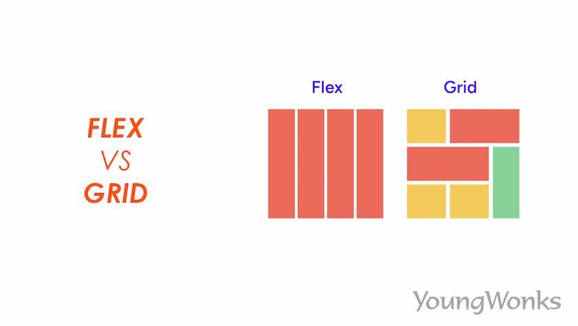
Flexbox is a one-dimensional layout model introduced in CSS3. It's primarily used for laying out items in a single direction—either as a row or a column. By setting display: flex on a container, you enable flexible distribution of space among its child elements.
Key Features of Flexbox:
- Alignment and Justification: Easily center items or distribute them evenly with properties like justify-content, align-items, and align-self.
- Flexibility: Items can grow or shrink based on available space using flex-grow, flex-shrink, and flex-basis.
- Ordering: Change the visual order of elements without altering the HTML structure via the order property.
- Responsive Design: Great for handling dynamic content where items need to wrap or adjust based on screen size.
Pros:
- Simple to implement for linear layouts.
- Excellent browser support (works in all modern browsers).
- Ideal for components like navigation bars, card layouts, or form elements.
Cons:
- Limited to one dimension, so complex two-dimensional layouts require nesting flex containers, which can get messy.
- Not as intuitive for grid-like structures where rows and columns need precise control.
What is CSS Grid?
CSS Grid is a two-dimensional layout system that allows you to create grid-based designs directly in CSS. By applying display: grid to a container, you define rows and columns, placing items exactly where you want them.
Key Features of CSS Grid:
- Grid Tracks: Define rows and columns with grid-template-rows and grid-template-columns.
- Placement: Position items using grid-row, grid-column, or named areas with grid-template-areas.
- Gaps and Alignment: Control spacing with gap and align content with properties like justify-items and align-items.
- Auto-Placement: Items can automatically fill the grid without explicit positioning.
Pros:
- Perfect for overall page layouts, like dashboards or photo galleries.
- Handles both rows and columns simultaneously, making it powerful for complex designs.
- Reduces the need for media queries in some responsive scenarios.
Cons:
- Steeper learning curve compared to Flexbox.
- Slightly less support in very old browsers (though excellent in modern ones).
- Overkill for simple, one-dimensional arrangements.
Flexbox vs. Grid: A Side-by-Side Comparison
To make the decision easier, here's a quick comparison table:
Aspect Flexbox CSS Grid Dimensionality One-dimensional (row or column) Two-dimensional (rows and columns) Best For Aligning items in a line, like menus or cards Full-page layouts, grids, or complex structures Item Placement Flow-based, with ordering flexibility Explicit placement via lines or areas Space Distribution Flexible growth/shrink of items Fixed or fractional tracks Nesting Required Often for 2D effects Rarely, as it's inherently 2D Use Case Examples Navigation bars, centering content, equal-height columns Magazine layouts, dashboards, masonry grids Learning Curve Easier for beginners More concepts to grasp When Should You Use Flexbox?
Choose Flexbox when:
- You're dealing with a linear arrangement of items.
- You need items to dynamically adjust to available space, like in a responsive navbar where links wrap to the next line.
- Simplicity is key, and you don't want to overcomplicate a straightforward layout.
Example: A horizontal list of social media icons that space out evenly and wrap on smaller screens.
When Should You Use CSS Grid?
Opt for Grid when:
- Your layout requires precise control over both rows and columns.
- You're building something like a product grid, form with aligned labels, or an entire webpage structure (header, sidebar, main content, footer).
- You want to create overlapping elements or asymmetric designs without hacks.
Example: A responsive photo gallery where images are arranged in a 3x3 grid on desktop but stack vertically on mobile.
Can You Use Both Together?
Absolutely! Flexbox and Grid aren't mutually exclusive—they complement each other. For instance, use Grid for the overall page layout and Flexbox for components within grid items, like aligning text and buttons inside a card. This hybrid approach leverages the strengths of both systems.
Conclusion
Ultimately, the choice between Flexbox and Grid depends on your project's needs. If it's a simple, one-directional layout, go with Flexbox for its ease and flexibility. For more complex, two-dimensional designs, CSS Grid is your powerhouse. Experiment with both in your next project—browser dev tools make it easy to toggle between them. As web standards evolve, mastering these tools will keep your designs modern, responsive, and efficient.
If you're ready to dive deeper, check out resources like MDN Web Docs for interactive examples. Happy coding!